Janet Yellen Speaks Out on Inequality and Opportunity in America

2014-10-27 Yellen at FRB Boston
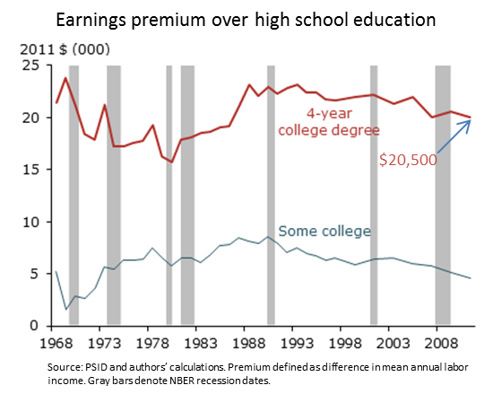
Last week, the Chair of the Federal Reserve Janet Yellen spoke about inequality and opportunity in America. Her remarks were based on recent results from the Federal Reserve’s triennial Survey of Consumer Finances (SCF). The survey includes roughly 6,000 U.S. households and provides specific details about their income, wealth, and debt. This look at family balance sheets formed the basis for Chair Yellen’s remarks on inequality and economic opportunity in the U.S.

You can watch the video, read the full speech, and view the slides at the bottom of this page.

I wanted to highlight for you the four building blocks of economic opportunity that were identified by Chair Yellen in her speech, along with some supporting charts from the survey. In future posts, we’ll dive more deeply into the topic of inequality.

Four Building Blocks of Economic Opportunity in America

#1. Resources Available for Children

2014-10-24 Yellen 1 Fig 9
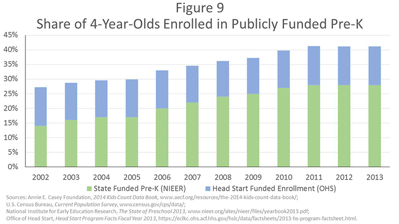
Figure 9 above shows that access to quality early childhood education has improved since the 1990s, but it remains limited–41% of children were enrolled in state or federally supported programs in 2013.

Continue reading

Students and Money – The 2012 PISA results

This week we wanted to take a deeper dive into the recent PISA financial literacy assessment by looking at the test framework and reviewing a snapshot of student performance across the 18 countries that participated.

What is Financial Literacy? – PISA Definition

Financial literacy is knowledge and understanding of financial concepts and risks, and the skills, motivation and confidence to apply such knowledge and understanding in order to make effective decisions across a range of financial contexts, to improve the financial well-being of individuals and society, and to enable participation in economic life. (via)

The Students and Money Framework

The financial literacy assessment consisted of a total of 40 questions organized into three broad perspectives: content, processes, and context. Under each of these perspectives, four categories of questions were then identified. These 12 categories formed the PISA “framework” for measuring financial literacy, see table below:

Continue reading

Looking for Evidence? The What Works Clearinghouse Can Help

IES What Work ClearinghouseIf you’ve ever wondered if a new teaching strategy, school improvement program, or educational policy actually works from an evidence-based perspective, then consider subscribing to the What Works Clearinghouse (WWC) Study Review series.  Every month (roughly) the WWC releases short (two-page) reviews of important educational studies by describing the intervention and the findings.

These high level snapshots of research are a quick read and point you to deeper information about the study’s details.  In addition – and this is the big value-add! – the WWC provides a rating of each study based on the scientific quality of the research design and analysis.

Continue reading

Teaching About Income Inequality – Three Charts and Two Tips

If you’re looking for a quick start into the issue of income inequality, our new DataPost series might just do the trick. The series uses a fairly simple comparison to define income inequality and chart that comparison over time. The full series includes: U.S. Household Incomes: A Snapshot, Median Household Incomes: Life in the Middle, and Income Inequality: Measuring the Gap.

To introduce the idea of income equality to your students, consider using the following three charts.

1.     Income Distribution

The first place to start the discussion is by taking a look at the distribution of U.S. household incomes. The chart below gives the percentage of U.S. households in each income category. At the lowest end of the distribution, 3.4% of American households earned less than $5,000 in 2012. At the highest end of the distribution, 4.5% of American households earned $200,000 or more in 2012.

There are some interesting things to note about the shape of this distribution.  First, there are more households in the lower income categories than you might expect.  In a normal distribution – think the bell shaped curve – values tend to pile up in the middle.  Here, though, there are greater concentrations at the low end of the distribution.

Continue reading

Why it Still Pays to Get a College Degree

Has the high cost of college tuition discouraged your students from considering college a viable option? A new study from our researchers here at the SF Fed suggests that a college degree is still a great investment for the average student.

Three Reasons to Get that Degree

1.  Higher Annual Earnings: Although common knowledge, it’s worth repeating – college graduates, on average, out earn high school graduates year in and year out. In 2011, the difference between annual wages of someone with a four-year degree and a person with a high school degree averaged $20,050. That’s a 61% earnings “premium” for having a college degree (see chart below).

Why it still pays to get a college degree Figure 1

Continue reading