Money. We use it daily, whether electronically or as cash (the demise of which is greatly exaggerated). We are all are familiar with it in its current form. But how much do you know about the history of money? Use these five surprising facts to help history come alive for your students through currency.
1. Before the Civil War, paper money could be issued by nearly anyone
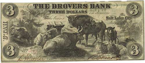
Private Bank Note, Drover’s Bank, Salt Lake City, Utah, $3, 1856
Between 1837 and 1866, a period now often called the “Free Banking Era,” lax federal and state banking laws permitted virtually anyone to open a bank and issue currency. Paper money was issued by states, cities, counties, private banks, railroads, stores, and churches. In the 1860s, an estimated 8,000 different state banks were circulating bank notes in denominations from ½ cent to $20,000!
These notes came in a variety of sizes, colors, and designs, and that combined with an environment of uneven regulations from area to area is widely considered to have increased the public’s appetite for centralized banking regulation.
As the American population moved Westward, some of the issuing institutions earned the dubious nickname “wildcat banks,” in reference to their remote locations, more accessible to wildcats than people. The Free Banking Era ended with the passing of the National Bank Act of 1863.
Continue reading

 If you’ve ever wondered if a new teaching strategy, school improvement program, or educational policy actually works from an evidence-based perspective, then consider subscribing to the What Works Clearinghouse (WWC) Study Review series. Every month (roughly) the WWC releases short (two-page) reviews of important educational studies by describing the intervention and the findings.