
If you’re looking for a quick start into the issue of income inequality, our new DataPost series might just do the trick. The series uses a fairly simple comparison to define income inequality and chart that comparison over time. The full series includes: U.S. Household Incomes: A Snapshot, Median Household Incomes: Life in the Middle, and Income Inequality: Measuring the Gap.
To introduce the idea of income equality to your students, consider using the following three charts.
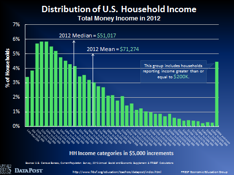
1. Income Distribution
The first place to start the discussion is by taking a look at the distribution of U.S. household incomes. The chart below gives the percentage of U.S. households in each income category. At the lowest end of the distribution, 3.4% of American households earned less than $5,000 in 2012. At the highest end of the distribution, 4.5% of American households earned $200,000 or more in 2012.
There are some interesting things to note about the shape of this distribution. First, there are more households in the lower income categories than you might expect. In a normal distribution – think the bell shaped curve – values tend to pile up in the middle. Here, though, there are greater concentrations at the low end of the distribution.
Second, we lumped together all incomes over $200,000 that represent roughly 4.5% of all U.S. households. The key data point from this chart is the median household income, which was $51,017 in 2012.
The reason we need to focus on the median income is that it is a typical measure reported every year and it becomes the focal point in the next chart. See the U.S. Household Incomes DataPost for more data, analysis, and discussion questions.
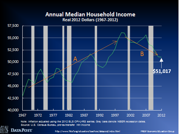
2. Median Household Income
The main thing to note in the chart below is how incomes in the middle of the distribution have changed over time. Starting in 1967, the median level of U.S. household incomes had generally been increasing until 1999, when it peaked at $56,080 (see Line A).
Since that time, and most sharply since early 2007, median incomes have fallen dramatically (see Line B). The most recent data available is 2012, when median household income equaled $51,017. The takeaway from this chart is that median household income is declining.
But, does that mean we have increasing income inequality? To answer that question, we need more data and a comparison. See the Median Household Income DataPost for more data, analysis, and discussion questions.
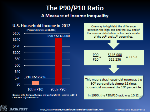
3a. Income Inequality
I know that the title of this post references three charts, but the slide below does such a nice job of explaining income inequality that I want to include it before we get to my final point. Basically, one way to measure income inequality is to divide the top and bottom of the income distribution and see how this ratio changes over time.
In the calculation below, the income level at the 90th percentile is divided by the income level at the 10th percentile. This division results in 11.93. Roughly translated, that means that households at the 90th percentile earn 12 times what households at the 10th percentile earn.
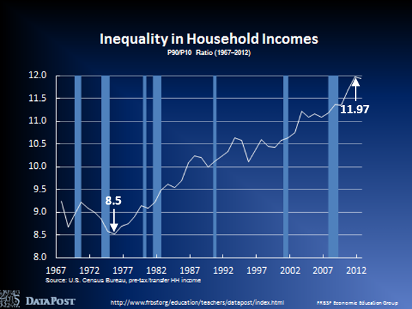
3b. Income Inequality
Armed with this ratio, we can look at the chart below and see that the difference between the top (90th percentile) and the bottom (10th percentile) has been increasing over time, peaking at 11.97 in December 2011, from a low of 8.5 in December of 1975. By this measure, income inequality has increased, as the gap between households at the top and bottom widens.
Two Tips
1. Other Measures of Income Inequality
The P90/P10 ratio is just one way of exploring income inequality. There are several other measures, two of which are published by the Census Bureau (equivalence adjust income and the Gini Index). You can also find a helpful overview of economic inequality measures from the Pew Foundation.
2. What about Thomas Piketty’s book?
Thomas Piketty’s Capital in the Twenty-First Century has become one of the most talked-about booked published in 2014. The topic is wealth inequality, which is a different approach to inequality than income inequality. Rather than looking at annual income earnings as we have done in this post, Capital in the Twenty-First Century examines patterns of wealth accumulation over time. If you’re interested in learning more, Dr. Piketty has a website where you can read about his conclusions and access the data used in his analysis. As you might imagine, this book has not been without controversy, so here is a blog post from the New York Times that provides a summary of the criticisms.
Income inequality is an important economic and social issue that is playing out in economies across the globe and in the media in a variety of forms. The DataPost series featured here can quickly launch your students into the data with relevant discussion questions at the end of each slide deck. I hope you have a chance to cover this critical topic with your students.
Additional Resources
For more information on economic inequality, we have three videos in our Economics in Person video series, with experts in the field discussing income inequality, economic mobility, and the evolution of top incomes.